Kurashi
An onboarding-first companion for moving to Japan. Answer nine short questions once, and a wall of unfamiliar bureaucracy becomes a dated plan you can work down, in a UI built to be read under stress.
- Role
- Everything: research, content, design system, Flutter app
- Stack
- Flutter · Dart · Riverpod · go_router · local notifications
- Ships as
- Android APK + web and macOS builds from one codebase
- Built for
- First-time movers to Japan, starting with me
- Data
- Entirely on-device. No account, no server, no network calls
- Content
- ~40 curated procedures, 11 city rubbish presets, 7 guides
- 01
The problem: everything at once, in a language you don't read
Moving to Japan isn't hard, it's just brutally front-loaded. In your first three weeks you have to register your address, enrol in national health insurance, sort out pension, open a bank account, get a phone number, and start three utility contracts. Each office wants a document the previous one produced, so doing them in the wrong order means going back twice.
Meanwhile the ordinary business of living is quietly different in ways nobody warns you about. Rubbish is sorted into up to ten categories, on days that vary between neighbouring wards, and put out before 8:00 on the morning, never the night before. Get it wrong and your bag is left on the street with a sticker on it.
The information exists. It's scattered across ward-office PDFs, forum posts from 2014, and blog articles that don't say which parts apply to you. None of it knows your arrival date, so none of it can tell you what's actually urgent. The facts are all out there. Nobody assembles them into a plan for you.
- 02
Onboarding is the product, not the front door
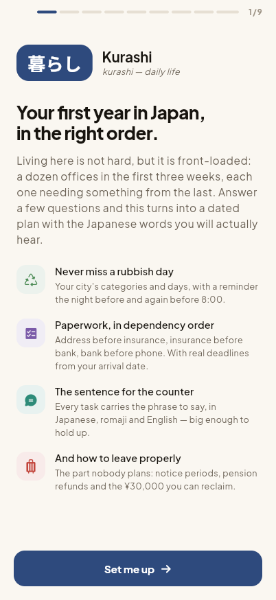
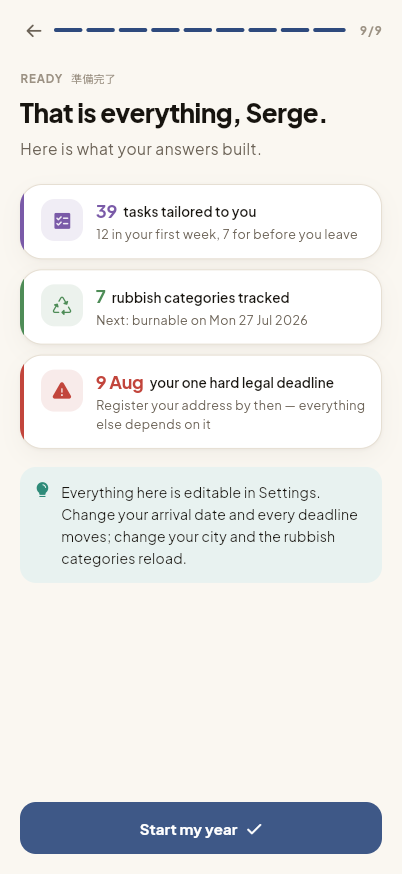
Most apps treat onboarding as a toll you pay before the real thing. In Kurashi it is the real thing. Nine short screens, each asking one question, and every answer removes work from the rest of your year.
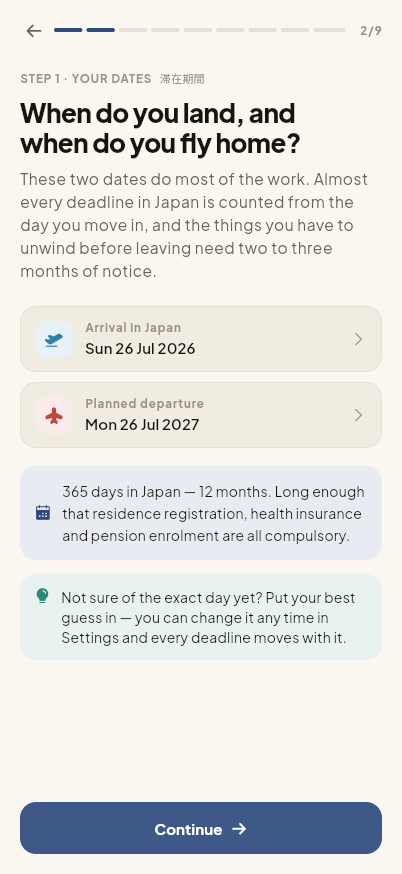
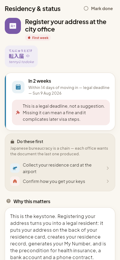
Your arrival and departure dates turn vague advice into real calendar deadlines. The fourteen-day legal window to register your address becomes a specific date, and it moves if your flight moves. Your city loads its own rubbish categories. Your housing type switches whole groups of tasks on or off: a dorm resident is never shown three utility contracts or a lease-notice deadline, because they don't have them. Saying you'll work part-time adds the work-permit application, the 28-hour rule, and the pension refund you can reclaim on the way out.
The step count is computed, not fixed: the utilities screen simply doesn't exist for someone in a dorm. It closes with a summary that shows what the answers built: thirty-nine tasks, twelve in your first week, seven rubbish categories tracked, next collection tomorrow, one hard legal deadline on the 9th of August. You start out knowing the shape of the year, instead of staring at a generic checklist.
- 03
Designing for someone who is overwhelmed
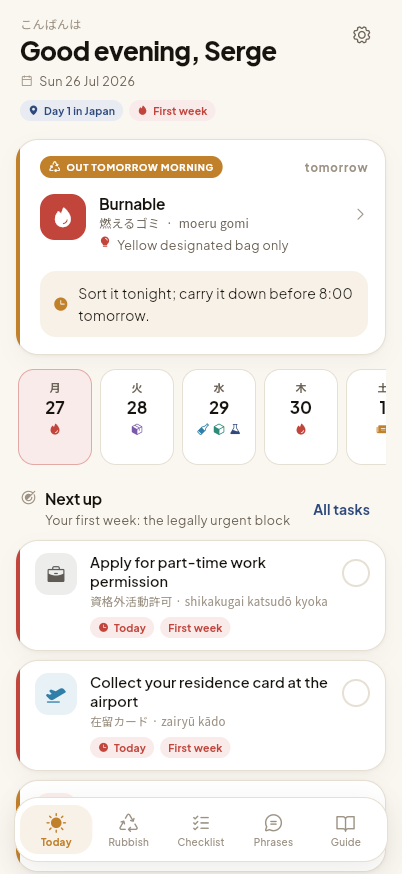
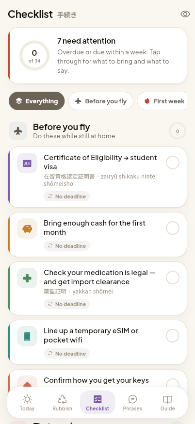
The person using this is tired, jet-lagged, and standing in a queue. That ruled the interface. Nothing is a wall of text: one idea per card, a short reason above every instruction, and the answer to 'what do I do right now' visible without scrolling.
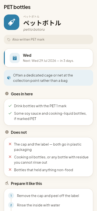
Colour carries meaning instead of just decorating. Each life domain and rubbish category owns a traditional pigment and a single icon, used identically everywhere, so you start navigating by recognition instead of reading. Burnable rubbish is always vermilion and a flame, paperwork always wisteria and a document. It deliberately avoids the default Material look: warm paper surfaces, a hand-built type scale, and a floating navigation bar rather than stock components.
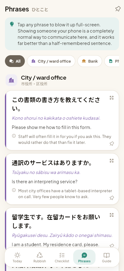
The teaching is built into the layout. Every procedure is introduced by the Japanese term the counter staff will actually say, with kana and romaji underneath, so you slowly acquire the vocabulary instead of just following orders. Each task carries the sentence to say, and tapping it fills the screen at a size you can hold up to someone across a desk. Where instructions are chained, the app shows why: your bank account sits visibly blocked until your address is registered.
- 04
What was hard
The scheduling engine took the most care. Japanese rubbish rounds come in two shapes: weekly, and 'the 2nd and 4th Wednesday of the month'. Repeating notifications can't express the second one. So the app derives concrete dated reminders about six weeks ahead and rebuilds them whenever anything changes, with an evening reminder to sort and an early-morning one to carry it down.
Ordering the checklist was subtler than it looked. Sorting purely by urgency buried an overdue legal deadline behind six trivial tasks; sorting blocked tasks to the bottom hid it entirely. It now scores by urgency, treats being blocked as a half-level penalty, then reorders so every prerequisite appears above the task it gates. The result reads as a list you can work straight down.
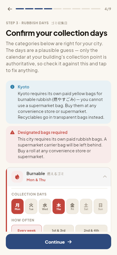
The last problem was honesty. A city's rubbish categories are city-wide and reliable, but the collection days are set per district and sometimes per street. Instead of faking precision, the presets seed the right categories with a plausible pattern and then walk you through confirming each day against the calendar on your own building's notice board, which is the only source that is correct.
What this means for your project
The argument here is that onboarding is design work, not a form to get past. Nine questions produce a properly personalised product, and that is the same problem as any configurator, wizard or setup flow in a business app: what to ask, what to infer, what to hide, and how to show the user that answering was worth the effort. It is also content-heavy UI built for readability under pressure. Colour and iconography carry meaning, the information architecture survives forty interlocking procedures, and the look was built from scratch instead of accepted from the framework.